Creator studio
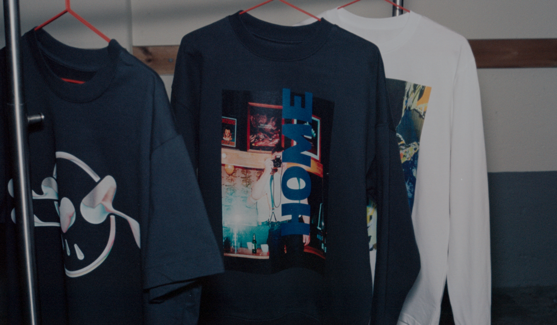
Common issues for artwork files using DTG
Gradient artworks
When using Direct-to-Garment (DTG) printing, the printing technique depends on the color of the garment:
- Dark/black garments: A white underbase is printed first, followed by the color layer to ensure more vibrant and true-to-color prints.
- Light/white garments: Only the color layer is printed, with no underbase.
Since dark garments have a white underbase, gradients may not print well. The white base might show through, affecting the gradient's look.
If you wish to use an artwork with gradient effects, we recommend to choose a light colored garment.
White on white and black on black
Due to the thin nature of the ink used in DTG printing, light-colored ink is often difficult to see on light fabric. To improve readability and visibility, it's recommended to add a darker background behind your design (if you wish to use a light colored artwork) or preferable, use artworks with darker colors.
Black Text on Black Garment When printing black text on a black or dark garment, the white underbase can sometimes make the design appear more grayish rather than truly black. To help the text stand out, it's a good idea to use a white or light-colored background on dark fabrics. A white underbase is used for prints that aren't white themselves, involving layers of white ink followed by a color layer to make the design's colors vibrant.
Fonts and Line Thickness
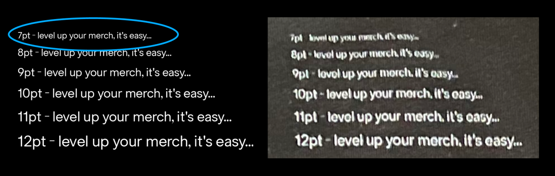
It’s important to use a minimum 7 point size but recommend at least a 9 on serif and sans-serif typefaces for reliable legibility when printed.
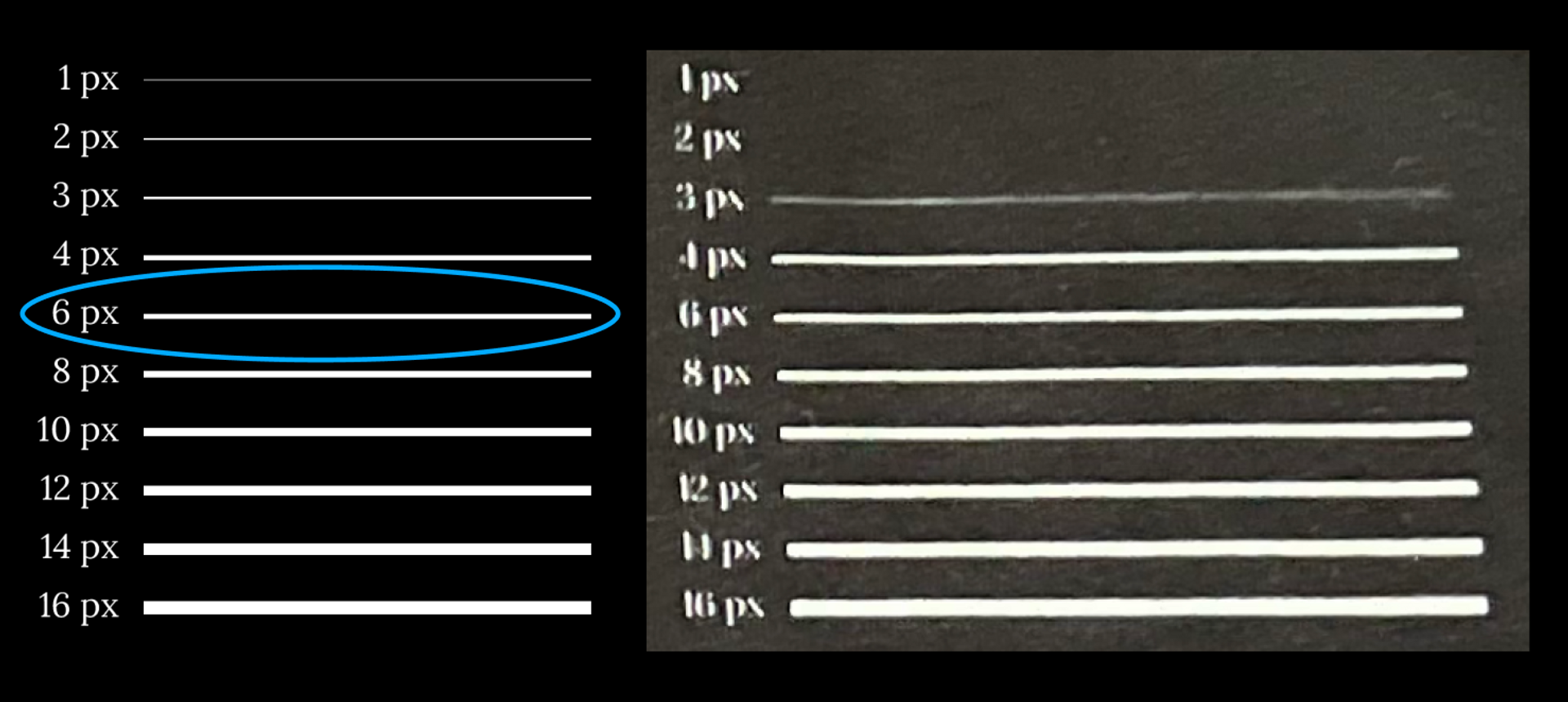
For both black on white and white on black, we recommend a minimum of 6 pixels in weight or more for a defined, legible line that holds its own when your artwork is scaled between XS-3XL sized apparel. It is possible to go down to 6 pixels in line weight if you wish, but anywhere lower than that and you may find the outcome lacking in visual punch.
was this helpful?

© Creator Studio 2025 - Part of H&M Group
106 38 Stockholm, Sweden